Growth is about friction. Most of the times it’s about removing friction, but sometimes it’s also about adding it.
When you remove friction somewhere in a user experience flow, the friction often comes back somewhere else. So the question shouldn’t be how to eliminate friction altogether. It’s more about making a deliberate choice about where it should live.
For example, your company has a very strict ICP. Everyone working there knows from experience that the product works really well for a specific type of customer, but not for others. Think investment banks but not consumer banks. Or enterprise companies but not SMBs. Or, like at Funnel for our MMM-product, companies above a certain monthly media spend but not those with smaller budgets.
You have a few options for how to deal with that.
You can say: we’re going to sell to everyone anyway and just see what happens. If you do that, there’s no friction on the website. People can just sign up and talk to sales. There’s also limited friction in the sales process, because salespeople don’t have to disqualify anyone. But then the friction shows up later, on your customer success teams and in the onboarding process, when these companies realize pretty quickly that the product isn’t great for them. That will lead to unhappy customers and high churn.
Another option is to put the friction on your first-line sales team, your SDRs. When someone excited about your product books a call, SDRs then have to tell them: “This isn’t really for you. You should try another vendor.” That’s not the worst outcome, but it’s still not great. The person might feel they’ve wasted their time. And if they don’t even hear it in person, just get an email saying you’re not a good fit, they’ll wonder why they didn’t see that on the website before booking anything.
Which brings me to the third option. You can add friction to the forms on your website. When people sign up, you can ask them what type of company they are, for example, using a simple dropdown. Going back to the previous examples, if someone selects consumer bank, or SMB, or indicates a media budget below your threshold, you can already tell them on the website that you’re not currently the best fit. Maybe you could mention that you’re happy to talk but can’t guarantee a good implementation. That way, nobody on your team spends time talking to people who aren’t a good fit. (And for the leads that are a good fit, the form fields help route them to the right person. Whether that’s an SDR, a mid-market AE, or an enterprise AE, you can only do this routing if you actually know enough about who just filled out your form.)
But this creates tension. If you’re a website product manager and your job is to increase conversion rate, one of the first things you’ll think is: let’s remove fields from the demo request form. That’s a very natural instinct, to remove friction from the website. But what will happen is, you remove it there, but it will come back later in the flow.
Can you automate this
Why not automate this? There are tons of lead enrichment tools that can figure out what type of company just booked a demo based on the email address. And then automatically send a message saying you’re not a good fit, cancel the meeting, suggest alternatives. That could be a good solution. But sometimes the thing you actually need to know isn’t something enrichment tools can tell you. Media spend is a good example. You can’t confidently pull that from a database. You can use proxies like company size or annual revenue, but it’s not the same thing. And regardless, you still don’t know how much time that person has already spent researching you. If they’ve been deep in your website for an hour, that automated email is still going to feel bad. Its not a great user experience to try to contact a company only to get an automated email back saying they don’t want to sell to you.
This is actually what makes product marketing and clear positioning so important, and why it needs to be reflected on the website. If your website does its job well, it should naturally communicate who the product is for, and implicitly, who it isn’t for. (And if your website doesn’t communicate that clearly, that is the friction you need to remove.)
I think this reflects how a website is not only a lead generation engine. It also needs to be a reflection of your brand and product.
How do companies actually handle this?
I looked at how a few companies handle this in practice, specifically at their sign-up and demo request flows. The pattern that emerges is pretty consistent.
Most modern B2B SaaS companies run two parallel streams. One is a self-serve track with almost no friction: you sign up with Google or GitHub, you’re in the product in seconds, and the company bets that if the product is good enough and you’re a good fit, you’ll upgrade or expand on your own. The other is a sales-assisted track, usually a “request a demo” or “contact sales” form, where the friction is deliberately higher because the goal is different. You’re not just creating an account, you’re entering a conversation with a human, and both sides benefit from some qualification upfront.
HubSpot is a clean example of this. Their free account signup is just an email address and a few SSO buttons. No company name, no job title, nothing. But if you click “Talk to Sales,” you hit a seven-field form asking for your website URL, number of employees, and company location:
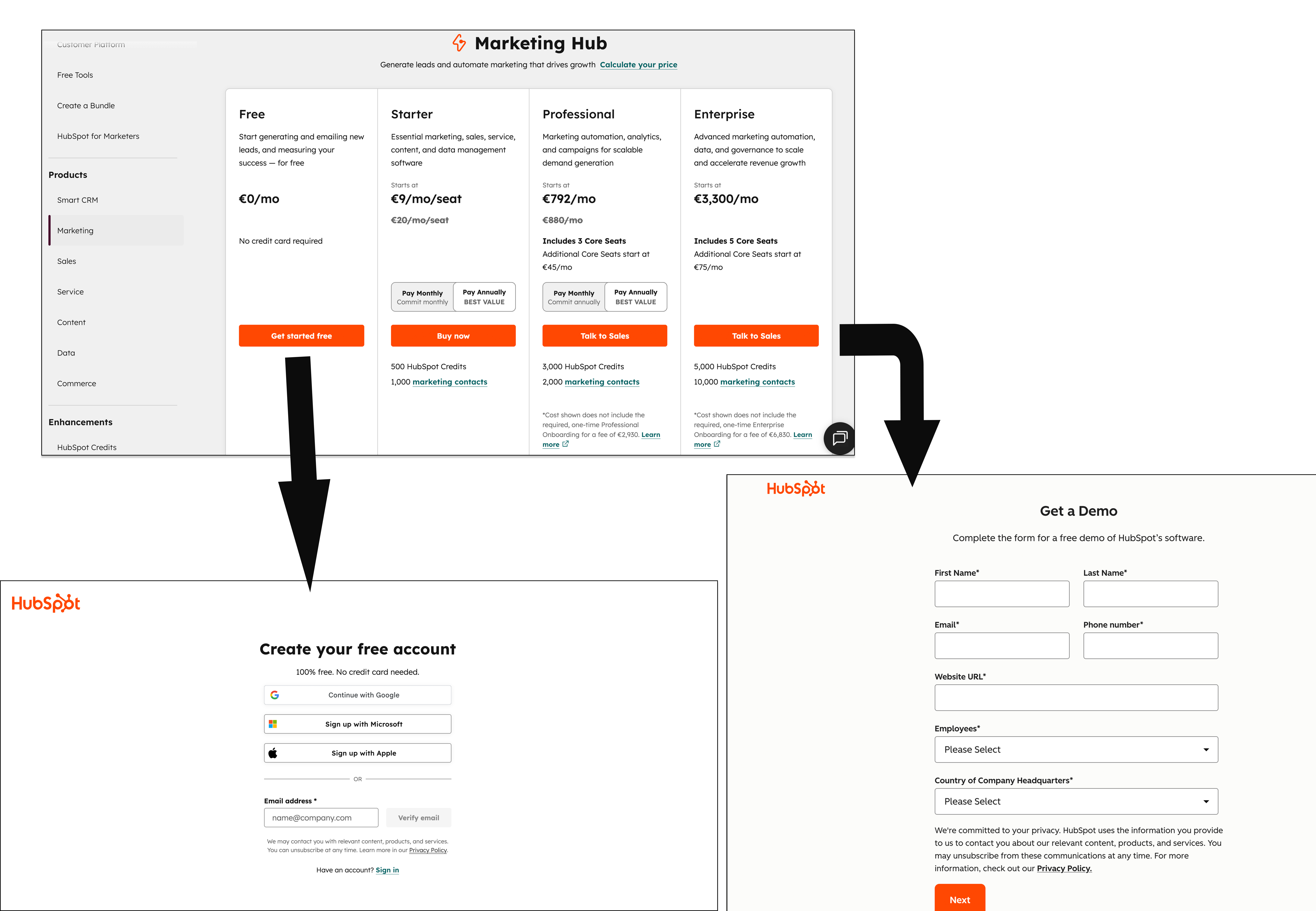
HubSpot free signup vs. Talk to Sales form
Now I didnt sign up for free, and there are probably some more fields after creating your account. But the friction of having to add more information is not in the form on the website, the friction is then in the next step, in the product.
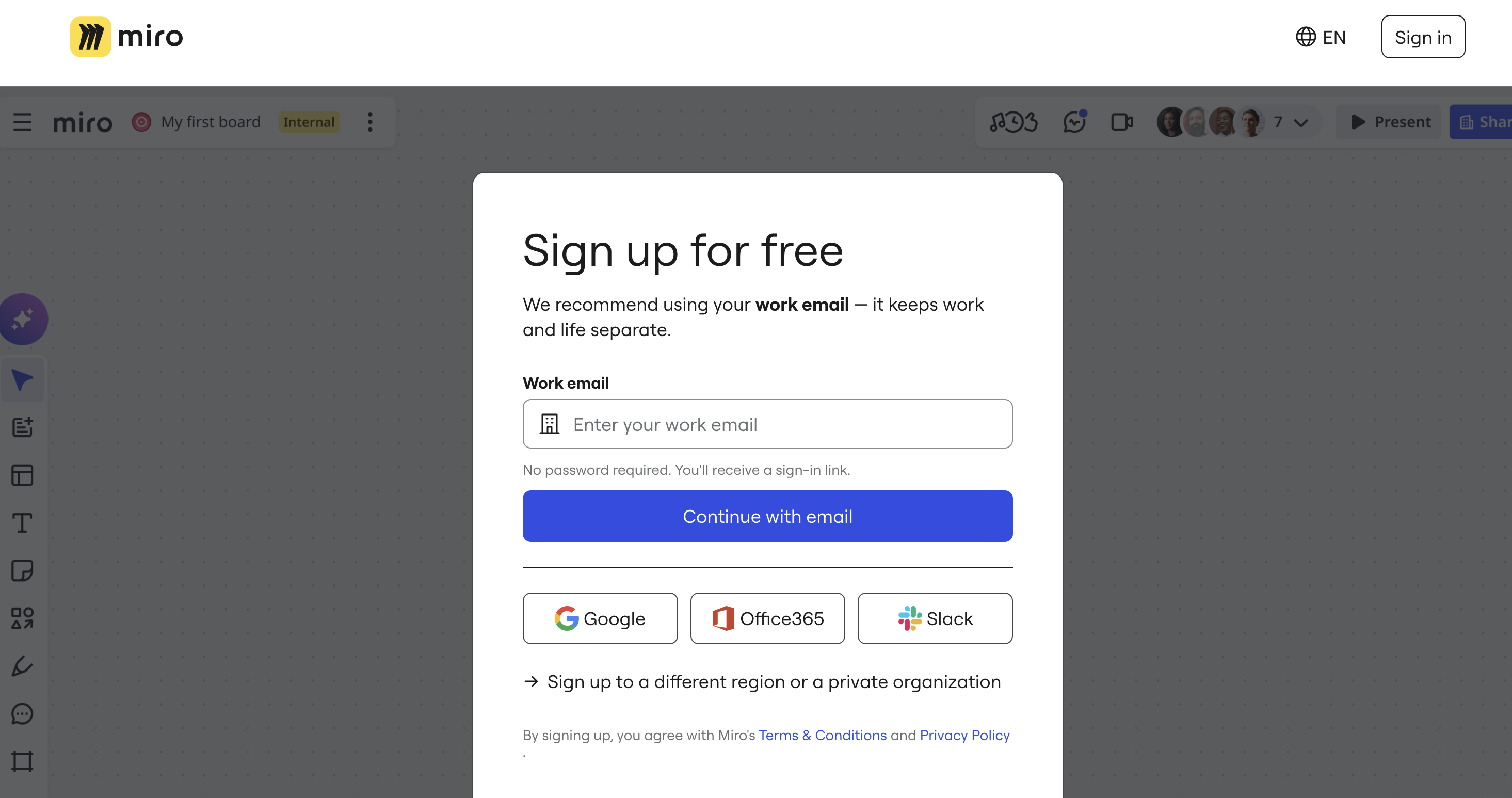
I also looked at an “AI-native” company, Lovable. Their homepage is similar to ChatGPT and Google. It’s just a text box that says “Ask Lovable to create…” You type something, hit enter, and a modal pops up asking you to create a free account with SSO. You’re in the product within seconds. But if you find your way to their enterprise page and click “Get a Demo,” there’s a proper multi-step form: name, work email, phone, company website. The ICP filtering is just done at a completely different layer than the website.
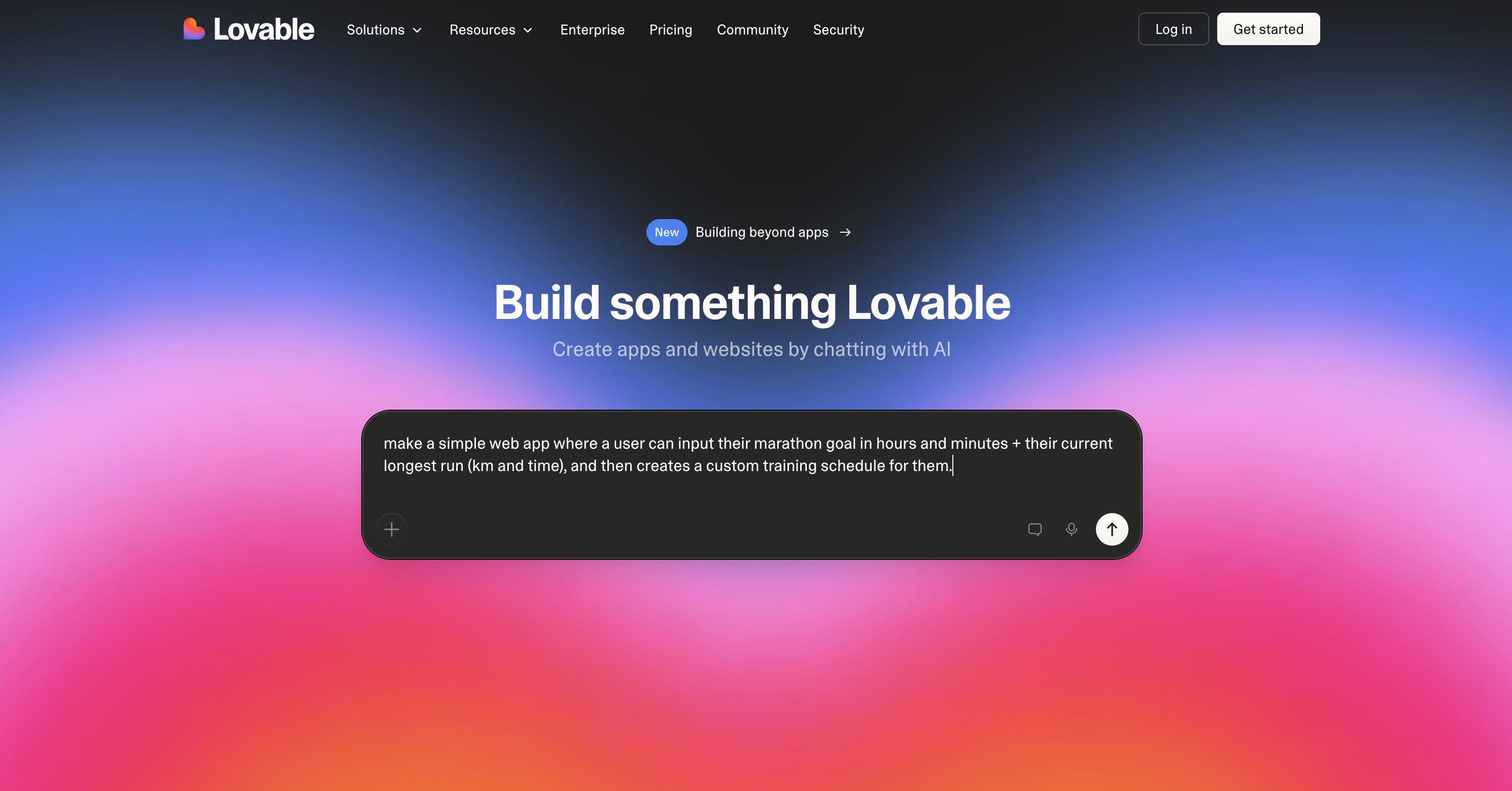
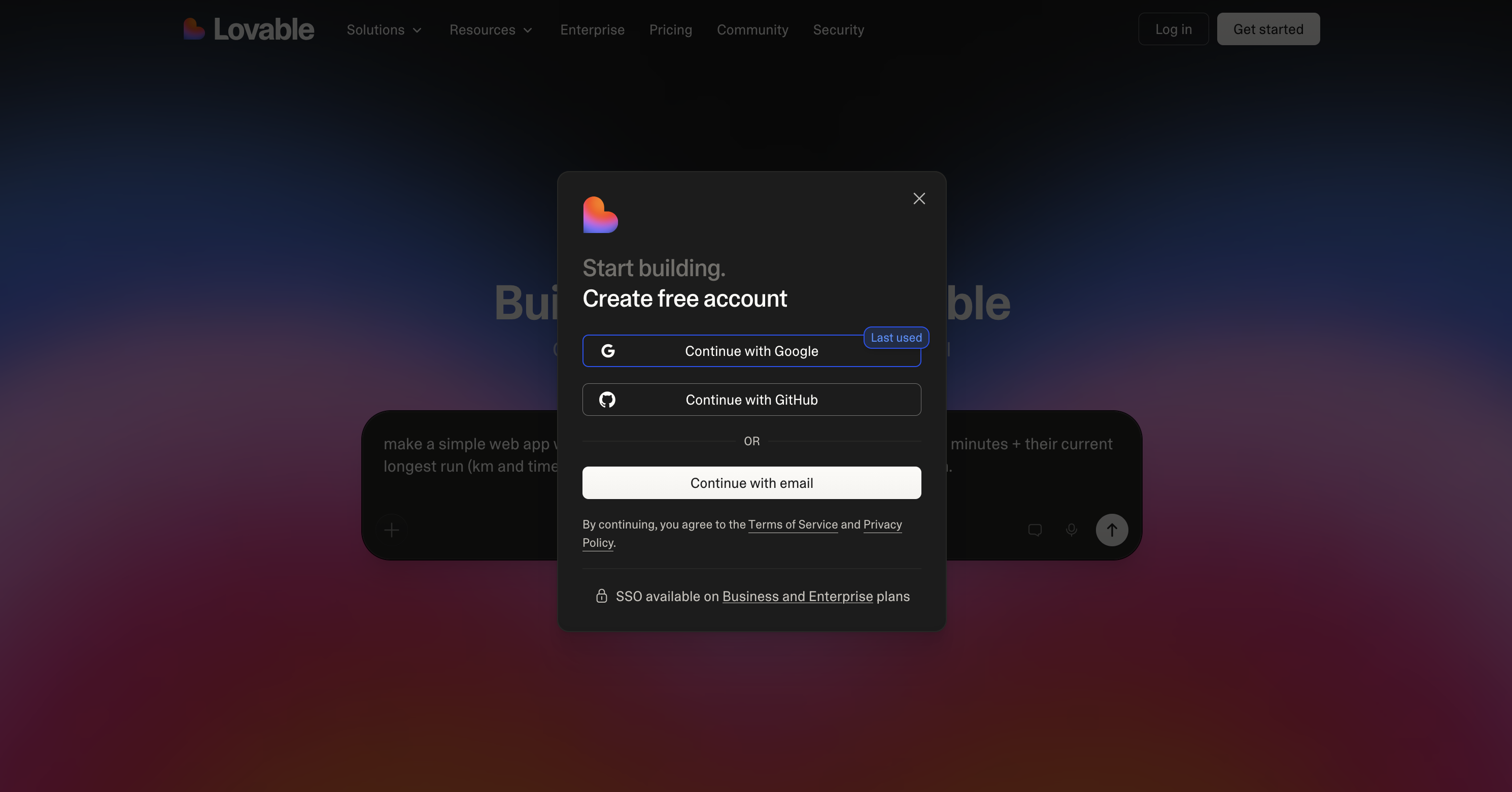
PLG flow
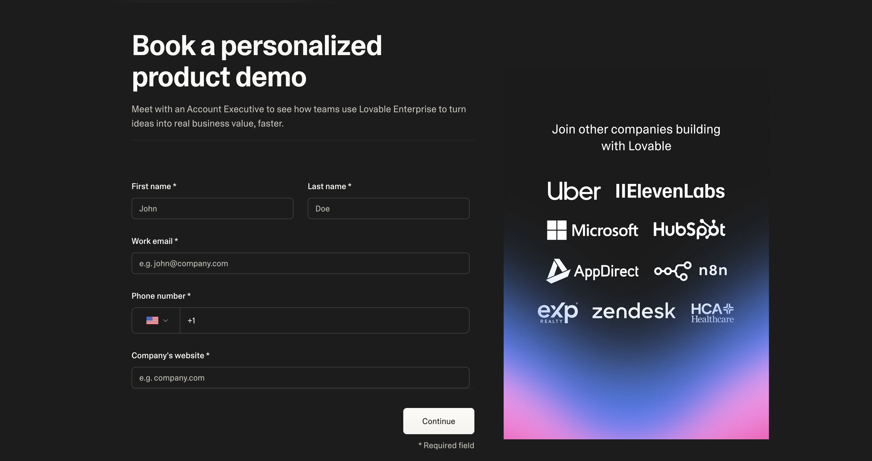
Enterprise flow
Salesforce is the interesting contrast, and the most revealing. They have a “Try for free” button that sounds like a self-serve PLG motion. But if you click it, you get an 8-question form split across three steps: first name, last name, job title, then company size, company name, country, then phone and email. They’ve broken it into steps to make it feel lighter, but it’s collecting exactly the same information as their “Contact me” enterprise form. There is no genuinely low-friction track at Salesforce. Everyone who signs up, whether they clicked “free trial” or “talk to sales,” goes through the same qualification process. That’s a deliberate choice, and it probably makes sense for them. Their buyer isn’t someone casually trying things out on a Tuesday afternoon.
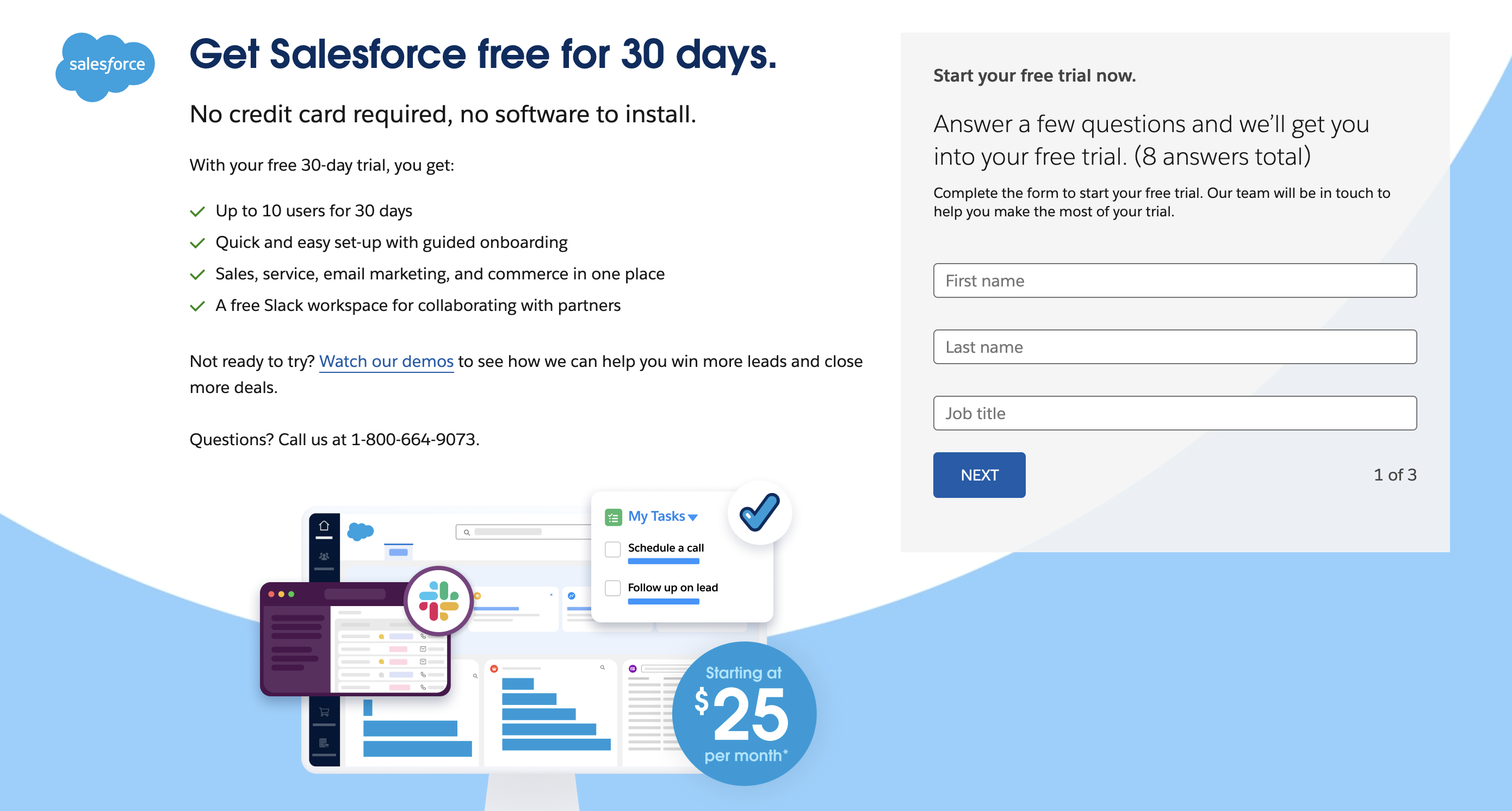
Step one of a three step form to create a free account
Miro sits somewhere in the middle. Their request-a-demo form is deceptively heavy: nine fields including expected number of users, use case, subject, and a free-text message box. That’s actually more than Salesforce’s contact form. But they also have a free tier with a very easy sign-up, so the two streams are genuinely distinct.
Free signup
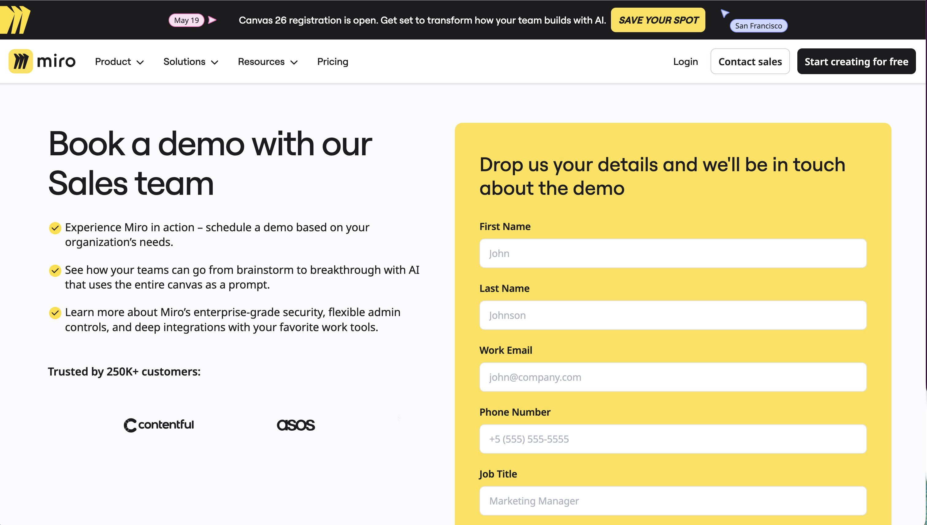
Enterprise demo request
Friction can also be a signal. A long form tells the visitor: this is a serious product for serious buyers. A one-click signup tells them: try it, no commitment. Neither is right or wrong, but both communicate something about who you are and what kind of relationship you’re offering. So Salesforce’s multi-step free trial form isn’t just collecting data, it’s also telling you what kind of company Salesforce is.
Looking at these examples, I think the important thing is to realize these aren’t just UX decisions. They reflect how each company thinks about their ICP, lead qualification, and enrichment.
When designing lead generation forms, conversion rate and user experience can’t be the only factors. You also need to make deliberate choices about where on the journey you want qualification and lead enrichment to happen. In practice, this means a web PM can’t just work closely with their designer. They need to be deeply aligned with the sales and commercial organization too, making sure first-line sales teams have the information they need to route leads correctly and have good conversations.
What the right form looks like will be different for every company. What might be more universally applicable is the way of working. At Funnel, every Friday I sit down with our sales development reps and performance marketing managers to review how things are going and stay aligned. This is the forum where we discuss things like forms and flows, and where we decide what to test next.
Curious to hear from others: how do you think about friction in growth? And is there anything worth reading on this? I’m pretty sure other people have written about it, and I’d love to find it.